“Horror vacui–a Latin expression meaning “fear of emptiness”–regards the desire to fill empty spaces with information or objects. In style, it is the opposite of minimalism.”
-Universal Principles of Design by Lidwell, Holden, and Butler
Horror vacui describes a website like Yahoo.com. It’s filled with images and links designed to entice users to click on something.
The opposite is a website like Is Steam Down?. Though the website isn’t beautiful, it’s minimalistic, and as a result, the site is very good at communicating its main message.
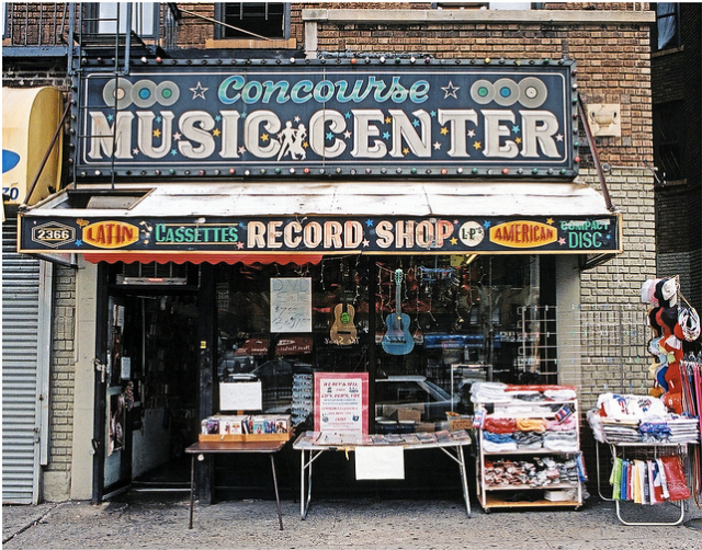
In general, people tend to perceive more value when there’s more empty space. Take the physical world as an example. The merchandise at the music center below may be extremely valuable, but how would a passerby know just by looking?
Contrast with a minimalistic Apple Store.

If you want to de-emphasize the value of individual elements, horror vacui can help. If you want to increase the elements’ appeal to users, reduce clutter.
What websites use minimalism (or horror vacui) well?


Pingback: Not All Complaints Are Created Equal | Sheldon's Software